OCELOTL | E-comerce mobile & desktop website

Daniella Tamez
Client: OCELOTL Fitness Nutrition
Role: UX designer designing an app for WABI SABI from conception to delivery.
Responsibilities: Conducting interviews, paper and digital wireframing, low and high-fidelity prototyping, conducting usability studies, accounting for accessibility, and iterating on designs.
Platform: Mobile App and Desktop.
Timeline: 2 and a half months.
Project background
OCELOTL is a sports nutrition brand that sells sports supplements. The brand has recently decided to sell its products online to reach a larger youth audience, so for this project it was requested to create an e-commerce with a unique design for both mobile and desktop.
Previously, sports nutrition brands were intended for a professional athletic audience. However, since the rise of the fitness community on YouTube starting in 2015, there has been a shift in the niche market and it has been directed towards an amateur athletic audience.
Value proposition
The product is the design of an exclusive e-commerce for OCELOTL with a responsive design for both mobile and desktop. Through the web, users will be able to buy the product that best suits their nutritional needs. There will also be a section for a blog with fitness recipes and tips for athletes who are just starting out in the fitness world.
Product goal statement
OCELOTL e-commerce will let users order online their favourite nutition product from the brand, wich will affect people who cannot buy in physical stores either because they do not know any closer one to their location, or because they do not have time to go shopping during stores opening hours.
User flow
In order to determinate the path taken by a typical user on the app, it was decided to create a simple User flow and Sitemap to indicate the actions of the user, the necessaries screens that the user needs in order to complete the tasks, and the decisions that the user has to make through their interaction with the product.

Sitemap

User persona
Using quantitative and qualitative data from interviews, survey results and investigations, a potential market niche was detected.
In the last 5 years, thanks to the rise of the video platform known as YouTube, many young people between the ages of 16 and 26 have begun to change their consumption habits and, therefore, their influences have also been modified. Among the communities that are formed within YouTube, the fitness community is one of the most notable, since it has several channels, both in Spanish and English. These channels have more than a million followers and each video can have hundreds of thousands of visits, so they reach a very wide audience, especially young people.
Thanks to the new trends, previously minority sports such as powerlifting, crossfit or bodybuilding have been gaining more followers, especially among the new generations. Thanks to this, more and more young people have been informed and interested in the world of sport.

After establishing a user persona, it was also created a User Journey in order to highlight the series of experiences the users had as they achieve a specific goal.

Paper wireframes


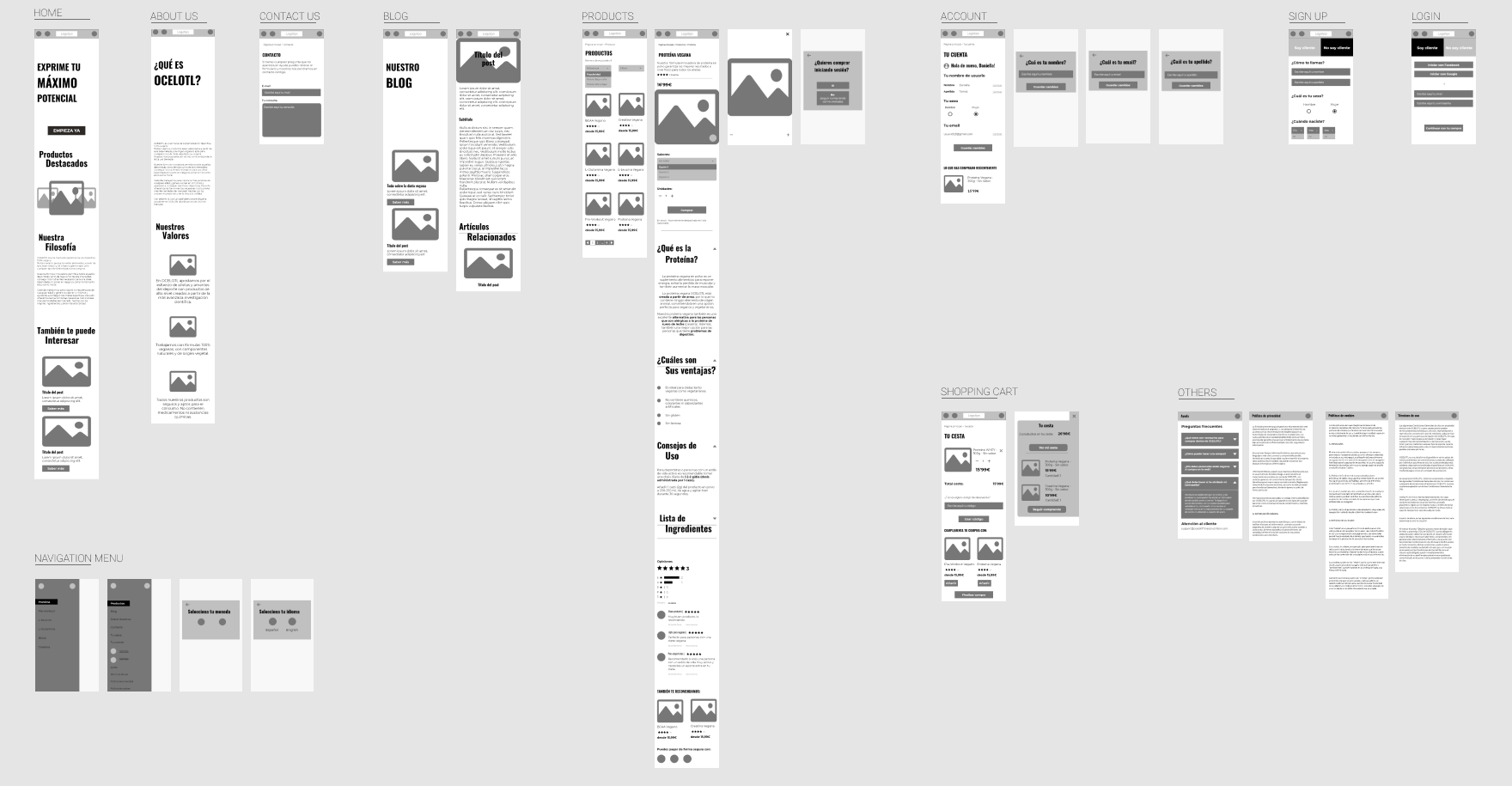
Low-fidelity digital wireframes
After all the previous research abou the user’s motivations, feelings and experiences, it was time to create lo-fi wireframes. They stablished the basic estructure of the app pages and highlighted the intended function of the product.

Final design
Design system guidelines/ Sticker sheet

High-fidelity mockups
The final high-fidelity prototype presented cleaner user flows for booking a table. It also met user needs for a delivery option as well as more customization.


Accessibility considerations
Provide access to users who are vision impaired through adding alt text to images for screen readers.
Use icons to help make navigation easier.
Use detailed imagery for sushi items to help all users better understand the designs.